
To create a new webform, follow the steps in Navigating the Webform Section. Once you have your webform created, you'll have to add elements to build the webform out. All of these elements can be searched by their name, so you can easily add them to your webform.
On this page:
Basic Webform Elements
Body Content
If you want to add HTML to your webform, either in the form of text or images, you'll need to use either the Basic HTML or Advanced HTML/Text elements.
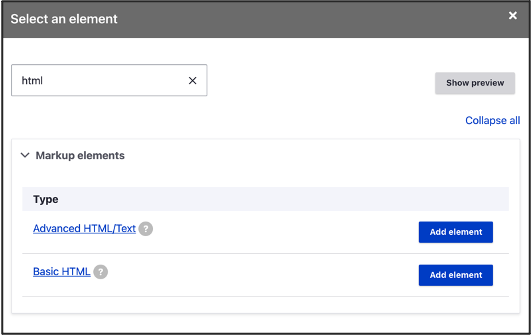
If you just need to add text, the Basic HTML element will work fine for you. If you're looking to add images, you'll need to use the Advanced HTML/Text element. Enter your content in the WYSIWYG editor and click save.
Name Element
When you need your users to enter their name, you can use the name element. When you add this element to your webform, you'll be able to check off the fields you want to display (Title, First, Middle, Last, etc.) depending on what information you need to collect. If you only need to collect their name, and it's not important that the user's First and Last names are in different fields, you can alternatively use the Text element for better accessibility.
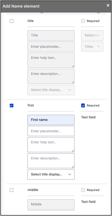
If you want the Name fields to appear horizontally, side-by-side in the webform (versus vertically), one below the other, select Yes under the Use Flexbox field.
Text Elements
When you want users to enter text content for open-ended text inquiries, you can use the:
- Text area element, which allows users to enter blocks of text for longer answers
- Text field element, which allows users to enter one line of text for short answers
To add a Text element, follow the steps below:
- Enter a Title — this is the question you're asking the user.
- If necessary, you can provide instructions to the user for how to fill out the field by entering a Description.
- You can set a maximum character length for the element in the Maxlength field under Form display.
Contact Information Elements
The Contact Information element allows users to enter personal contact information, such as an address, telephone number or email.
- Click Add element
- Type the contact information element you would like to include into the filter box and select the appropriate element. Examples of contact information elements include Address, Email, or Telephone (can also be used for cell numbers and fax numbers).
- Address functions the same way as Name element above:
- Title does not appear.
- Make any address fields visible or not visible on the form; and mandatory for user to fill out
- NOTE: The “State/Province” field does not have a list of provinces as a drop-down selection; if this field is to be used, change the settings from “Select” to “Text field” to allow users to enter the province manually.
- Edit address field names, if necessary
- To make address fields appear horizontally, side-by-side on the webform use the Use Flexbox field
- Email and Telephone: the only basic requirement is a Title.
- Address functions the same way as Name element above:
Date/Time Element
If you want to allow users to select a date (and time), the Date/Time element will work for you.
To add a date only:
- Click Add element
- Enter “date” in the filter box, and click Date
- Enter a title — this is the question that is being asked to the user
- You can enable a user to choose a date from a calendar by checking Use date picker and Show date picker button under Date settings
- Click Save
To add a date and time:
- Click Add element
- Enter “date” in the filter box, and click Date/time if a time also needs to be selected by the user
- Enter a title — this is the question that is being asked to the user
- Under Date settings, select how the user inputs or selects a date – date picker via calendar is an option there
- Under Time settings, select how the user inputs or selects a time – time intervals can be set in the Time step field
User Selection Elements
User Selection Elements allow users to choose from a set number of pre-selected answers to a specific question.
The main formats are: checkboxes, radios buttons, and drop-down select menus.
Checkboxes
- Click Add element
- Enter “checkbox” in the filter box, and select Checkboxes
- Checkboxes allow users to select multiple options from a list
- if only one checkbox is required, select Checkbox
- Enter a Title – this is the question that is being asked to the user
- Enter a value and text for each option – the text will be shown next to the checkbox on the webform; the value can be an abbreviation of the text (will not be shown on webform)
- If more options are required, enter the number of additional options needed and click Add and adjust the number of options necessary
- Adjust how the options are displayed on the webform in the Options display drop-down menu. You can choose between one and three columns, side by side and more.
- Click Save
Checkboxes other
- To enable users to select Other as an option, and allow them to enter their own answer, use the Checkboxes other element instead of the Checkboxes element. This element is the same, except it will provide users an Other option. When Other is selected, users will be given a text box to specify.
Radios or Select
- Click Add element
- Enter:
- “radios” in the filter box, and select Radios
- Radios allow users to select one of multiple options
- if the ability for the user to select Other as an option is required, then select Radios other
- “select” in the filter box, and choose Select
- Select provides users with a dropdown menu of options
- if the ability for the user to select Other as an option is required, then choose Select other
- “radios” in the filter box, and select Radios
- Follow the steps above for Checkboxes, as creating radios and drop-down select menus works the same way
Spam Filters
Spam filters may be added as a level of protection against unwanted webform submissions. Below are potential options to consider.
reCAPTCHA
reCAPTCHA may be added to your form to prevent spam. To add a reCAPTCHA element to your form:
- Click Add element
- Enter 'captcha” in the filter box, and select CAPTCHA
- Under the Challenge type field, select reCAPTCHA
- Click Save
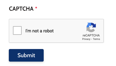
Users often need to select a checkbox or complete a puzzle in order to submit a webform. Below is an example of how reCAPTCHA displays on a website.
CloudFlare Turnstile
CloudFlare Turnstile is a spam prevention module that can be added to your Drupal website to assist with excessive webform spam. This module must be first configured by Upanup's development team, but once added to your website, it is a simple and effective tool to use. It provides more specific control over what types of submissions to block, and potential regions to block. Turnstile works without displaying a Captcha (puzzle) for users to complete. Below is a visual of how this tool looks on a webform.
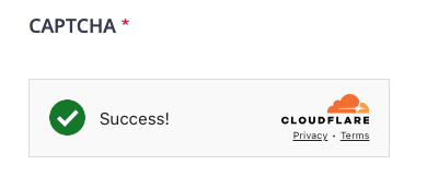
If you are interested in learning more about this feature or potentially adding it to your website, please contact Upanup for next steps.
File Upload Elements
Select one of the following elements to enable users to upload a specific type of file in the webform:
- Document file
- File
- Image file
The maximum number of files, maximum file size, and allowable file extensions can all be specified within the selected element.
Details
Details acts like an accordion, in that you can nest other elements in a heading and allow users to open and close the heading to view or hide the content.
Section or Fieldset
Creates a container that allows you to logically group elements together.
- Use Section if a Heading (H2, H3, etc.) is required
- Use Fieldset if a Heading is not required
Flexbox Layout
Allows you to display elements horizontally (side-by-side), as opposed to vertically (one underneath the other).
- Click the + Add layout button to add a Flexbox
- Use the crosshairs to drag existing elements under the Flexbox layout
OR - Click the Add element button beside the Flexbox once you have inserted it to add new elements under the Flexbox
We want to hear from you!
Our team at Upanup is always striving to make this guide better and more accessible for our clients. We’d love to hear from you, so we can continue to improve this guide.