A row component is a unique layout/function element that helps structure page content. When selected, the component is always added below the row title and content.
Below you'll find instructions and tips for using common row components. Your site may not have all the following row components. If you're interested in adding one of the following row components to your site, reach out to our support team to discuss.
1. To add new content rows head to the content rows tab on a new or existing page and select "Add Content row."
2. Then select what kind of content row you would like to add. Your options may look different depending on what kind of rows are available on your website.

Images
The Images row allows you to add one or more images to your content. If adding more than one image, the images will be shown in a gallery that users can scroll through. We recommend using the image row for any on page images, as it ensures the image scales with the browser window or device screen size, without squeezing surrounding text.
When using the Images row, we recommend using a JPG image with a ratio of 16:9 and a max width of 880px. This will ensure your image displays properly within the content row.
The Images row also allows you to add a caption or credit to each image, along with a credit link. Both of these are optional, but will display below the image if used.

Adding Images
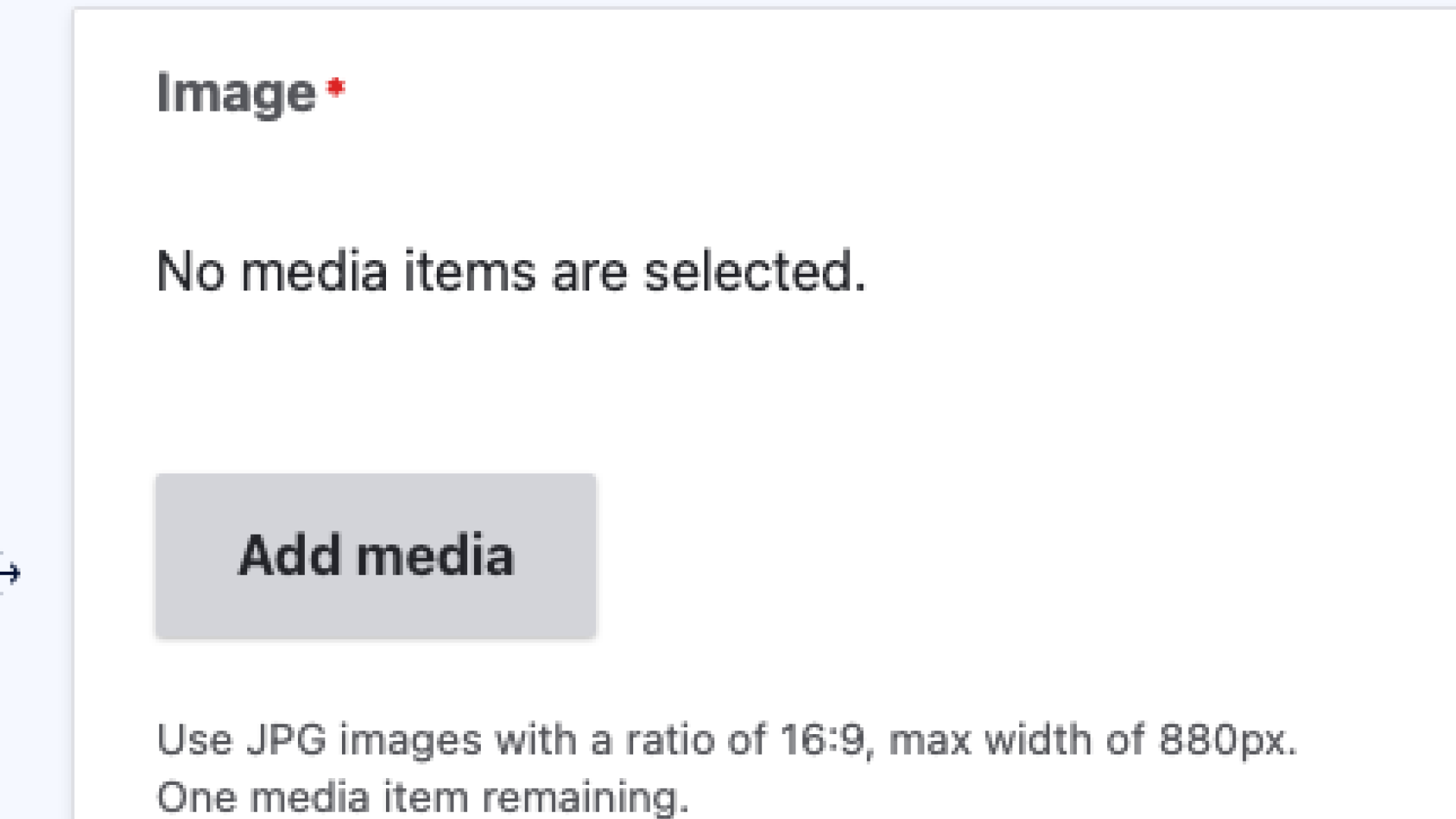
1. To add an image select the add media button.
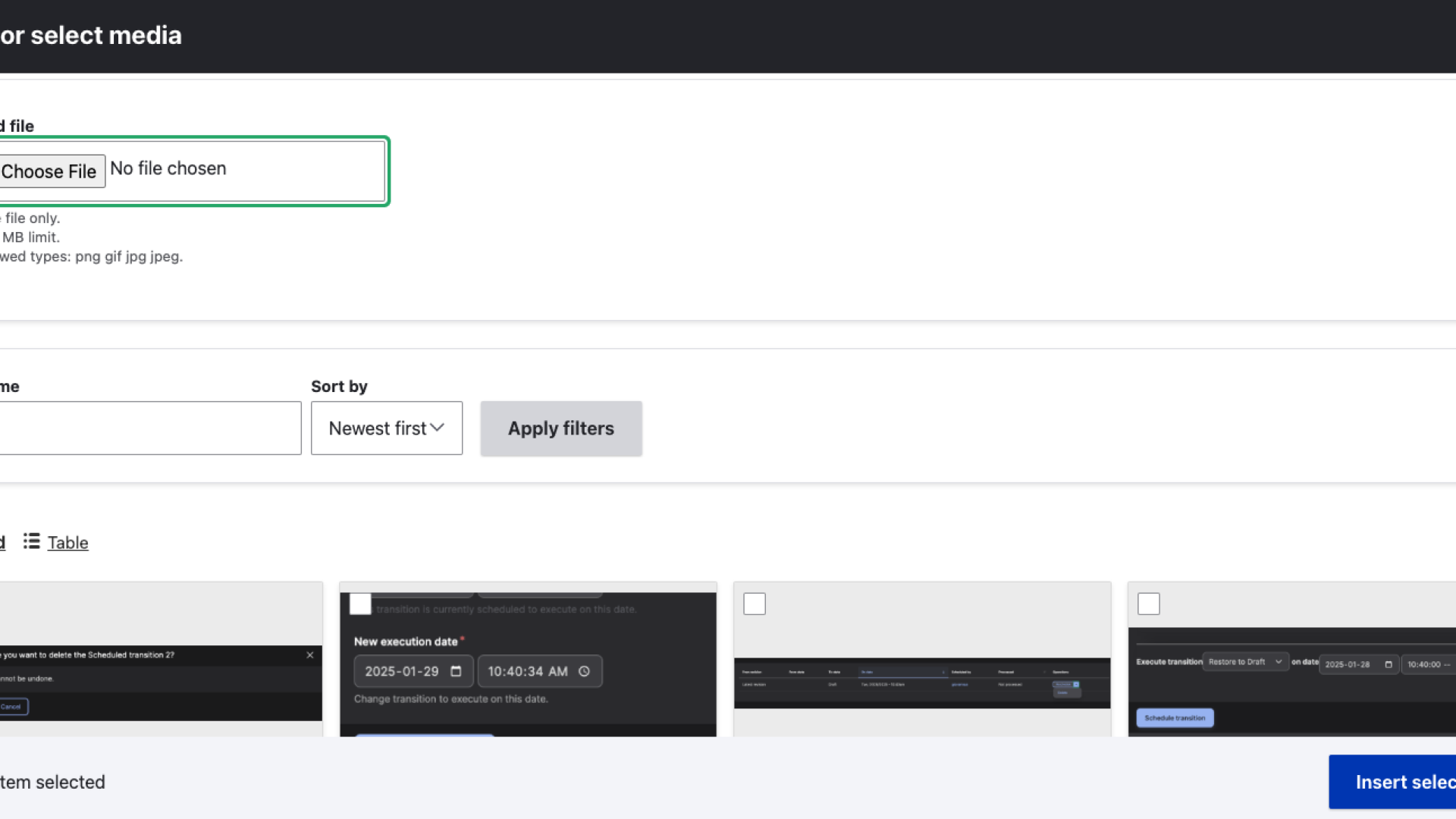
2. A window will pop up where you can browse for images on your local drive, select from images already uploaded on your website, or access an image database. These options may change on a case by case basis.
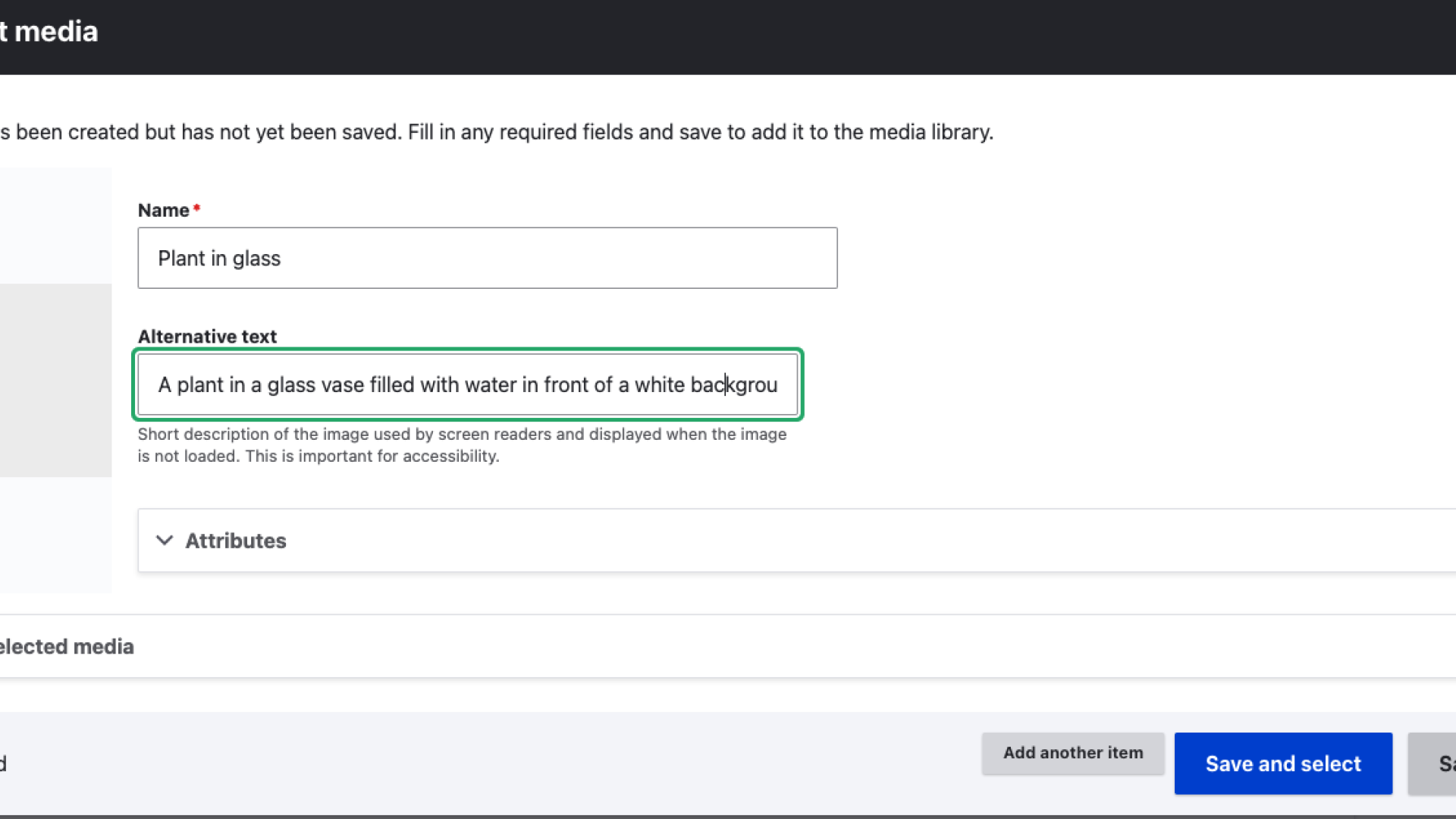
3. After choosing an image you can change the file's name and add alternative text if the image is not decorative.
4. Finally you can add a caption to be featured along with the image.
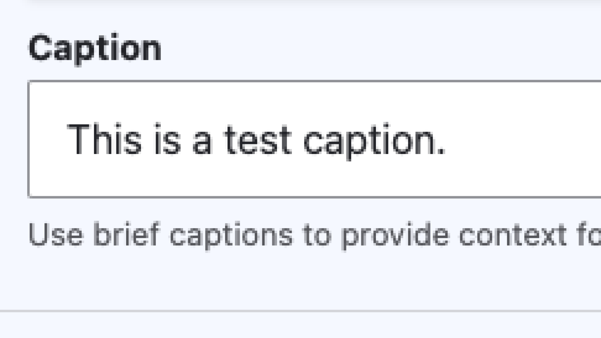
Image and Text Rows
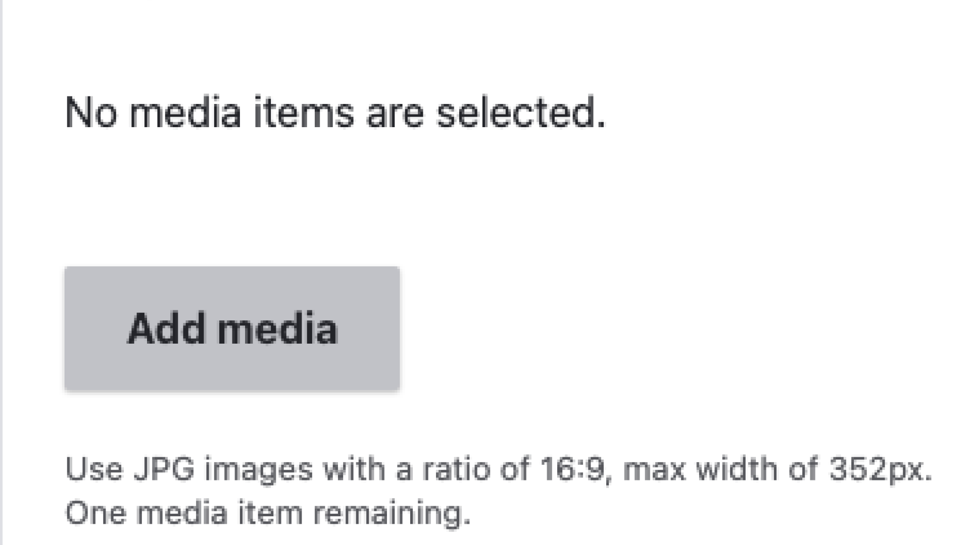
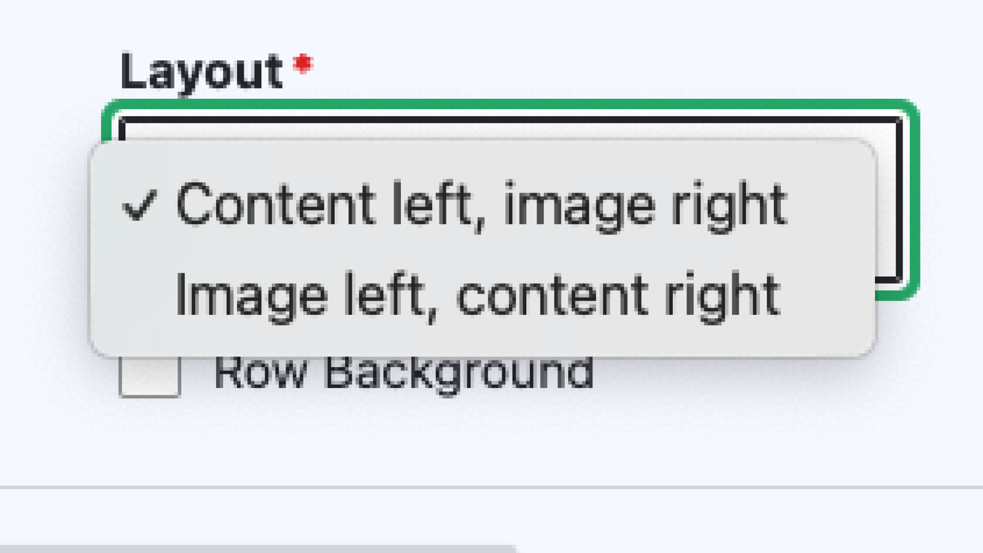
Sometimes, you don't want your image to appear in between paragraphs of text, but rather next to the text. When using the Image and text rows, you can add one image per row, but can add multiple rows at a time. For the best results, use a JPG image with a ration of 16:9 and a max width of 352px. The neighbouring text should stay around 300 characters, to match the size of the image. However, there is no limit to the amount of text you can add in this row. If adding above 300 characters, be aware that it may create white space under your image. You can also choose which side the image is on: either content left, image right or image right, content left.

Lorem ipsum dolor sit amet, consectetur adipiscing elit. Cras feugiat dolor metus, et maximus justo varius ut. Morbi eget metus dui.
Adding Image and Text Rows
1. Select the 'Add media' button.
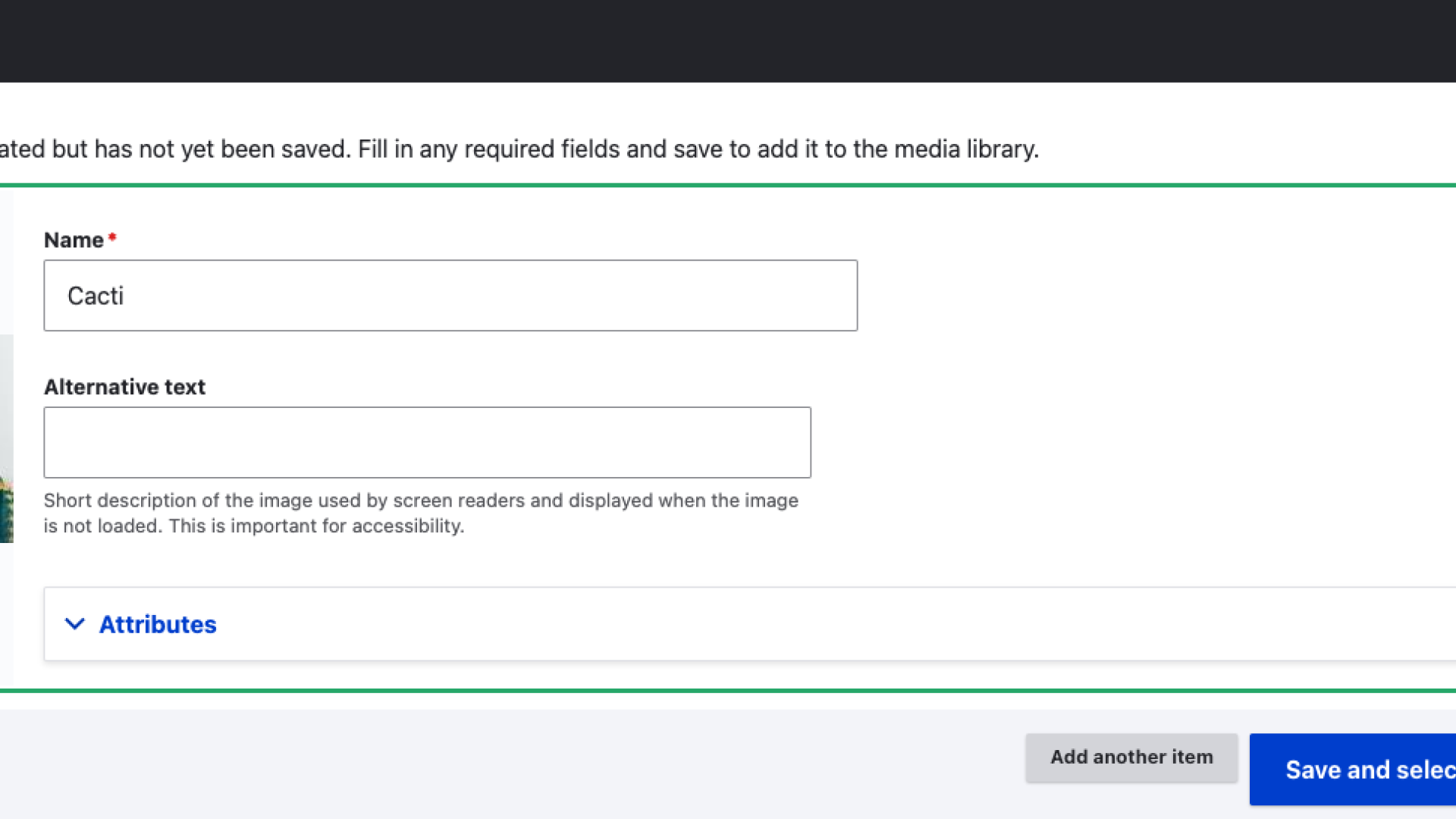
2. Just like adding an image row, you can change the name and add alternative text.
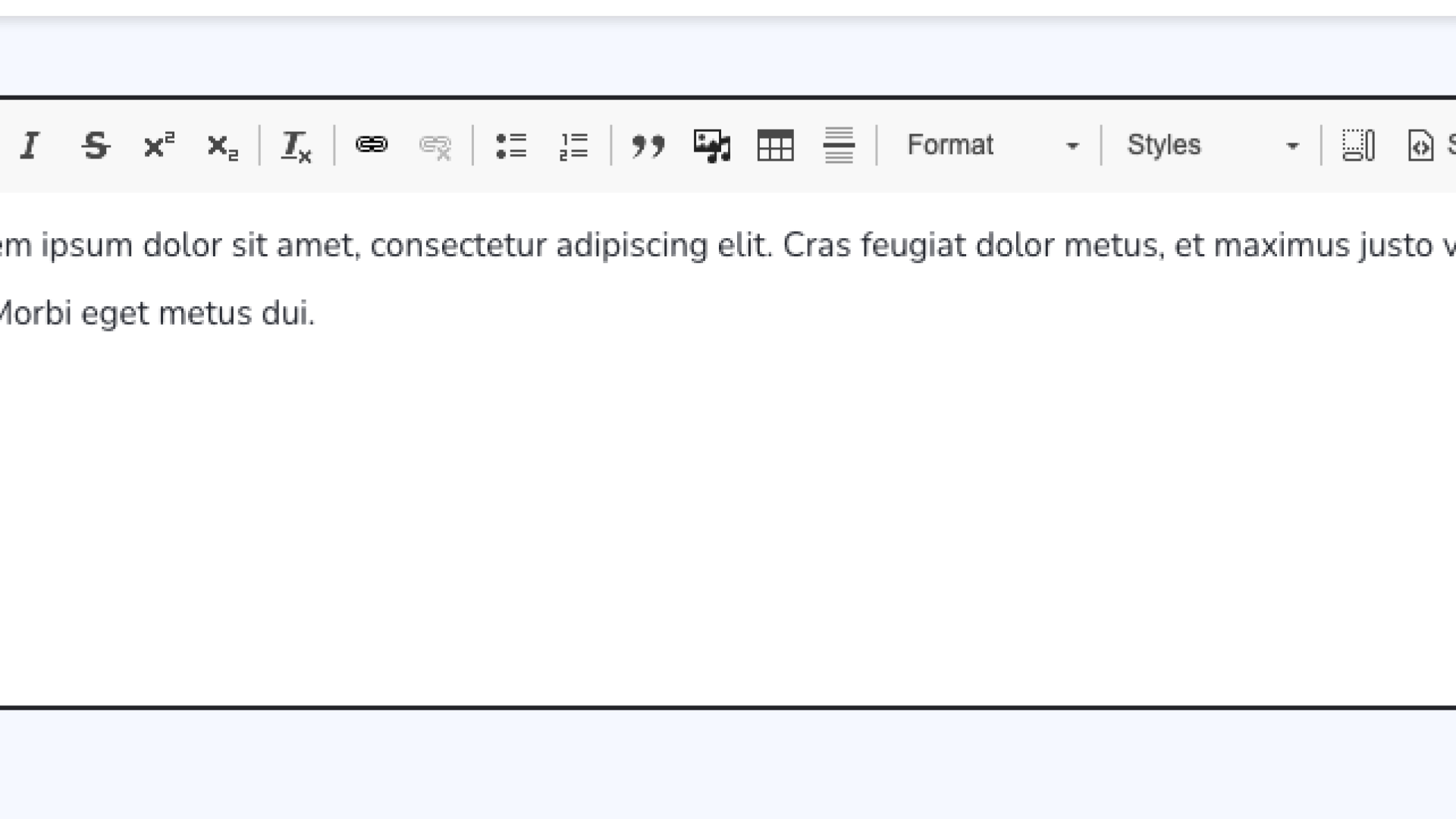
3. You can add text, links, lists, block quotes tables, or more media using the WYSIWYG editor
4. Choose a layout.
5. Finally, you can choose if the content row should have a different coloured background.
Accordion Group
Accordions, also known as collapsible content, are a layout tool for streamlining page content.
Accordions work best when used for context specific information, not as a main method of organizing page content. Context specific means accordions must clearly relate to the content row title and body content. The main content is the context in which the accordions exist.
By collapsing specific information, the page layout supports a focused user experience which targets all users. The accordions themselves are not meant to target all users, the content is specific, so it fits the needs of specific users.
Accordions should be used in the following cases:
- When users need only a few pieces of information on the page
- When the main task is a logical, step-by-step process
- When the information in each section is independent and users are unlikely to need simultaneous access to multiple sections
Do not use accordions when:
- Users require the majority or all the content on the page to find answers to their questions
- There is little content on the page
- The content has a deep hierarchy with multiple sublevels
- The content is scattered and difficult to summarize
- Users are likely to immerse in a continued flow of reading
Accordion best practices
- Treat accordion titles as 'labels' not as headers.
- The accordion group and accordion titles must be clearly related.
- Avoid using Header 2 for content within an accordion. Start with Header 3.
Adding Accordion Groups
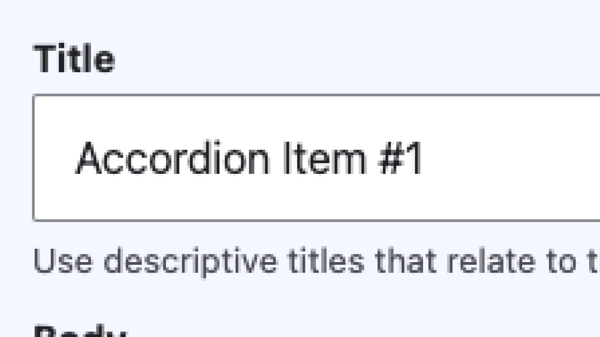
1. Add a descriptive title for your accordion.
2. Using the WYSIWYG editor, insert the content that will appear under the accordion drop down.
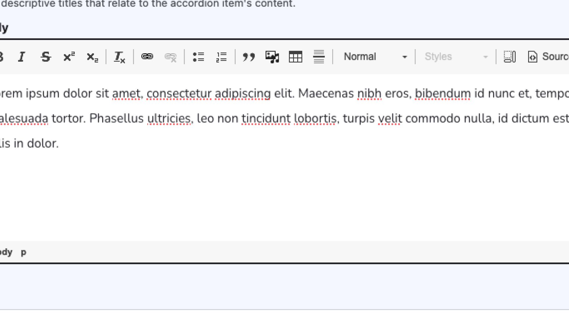
3. When you have finished creating one accordion item, you can add another by clicking the 'Add Accordion item' button.
Cards
Cards are a great way to create a visually prominent group of links. They consist of linked text and, optionally, an image and/or brief content describing the link. Because of their image and content option, Cards are a good choice for creating additional navigation for a section, or highlighting related content.
Within a Cards row, you can add multiple cards. Depending on your website's design, multiple cards will stack in columns of two to four.
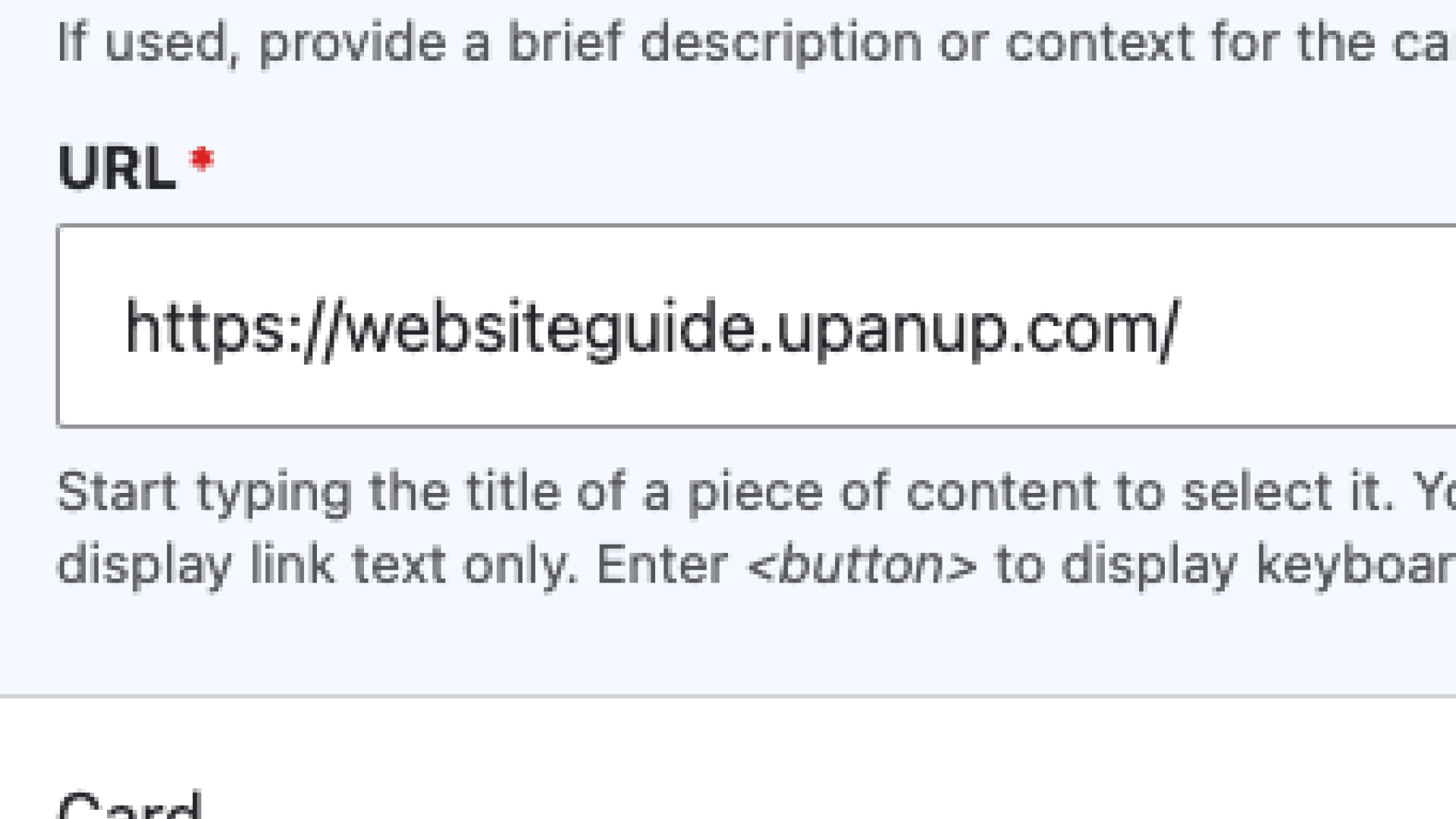
Individual cards require a title and a link, at a minimum. The title you give for your card will become the link text on the front-end. As a link, your title text should be descriptive of the links destination (read more about link accessibility). If you don't want to link your card, you can put <nolink> in the URL field, which will make the title unclickable.
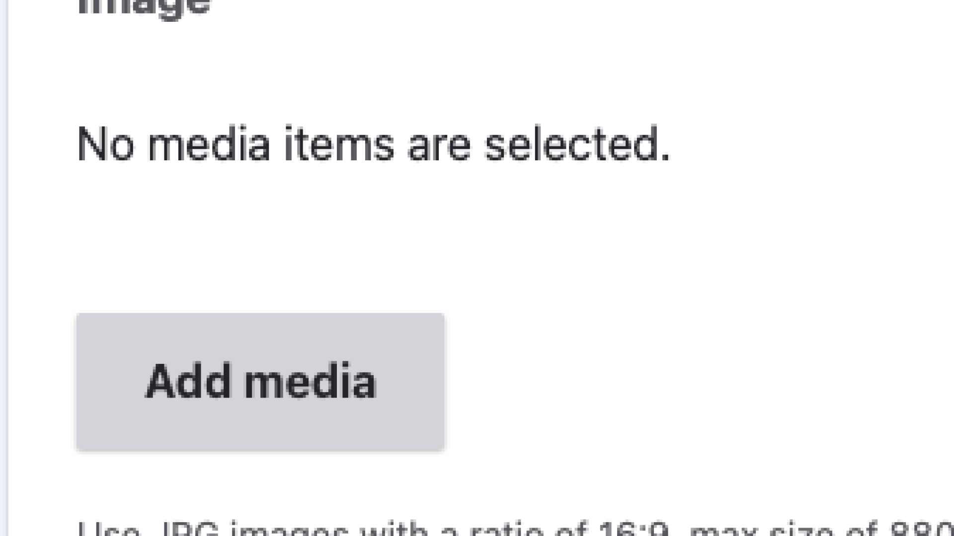
In addition to the title and link, you can add and image or content to your card. Your images should be a JPG, 16:9 with a maximum size of 880x495px. Try to match your image to the card link destination, to support your users as they skim the page. For content on your card, the default text limit is 255 characters, or around 30 to 60 words. Both images and content affect the size of your card, so we recommend filling cards in the same row consistently.
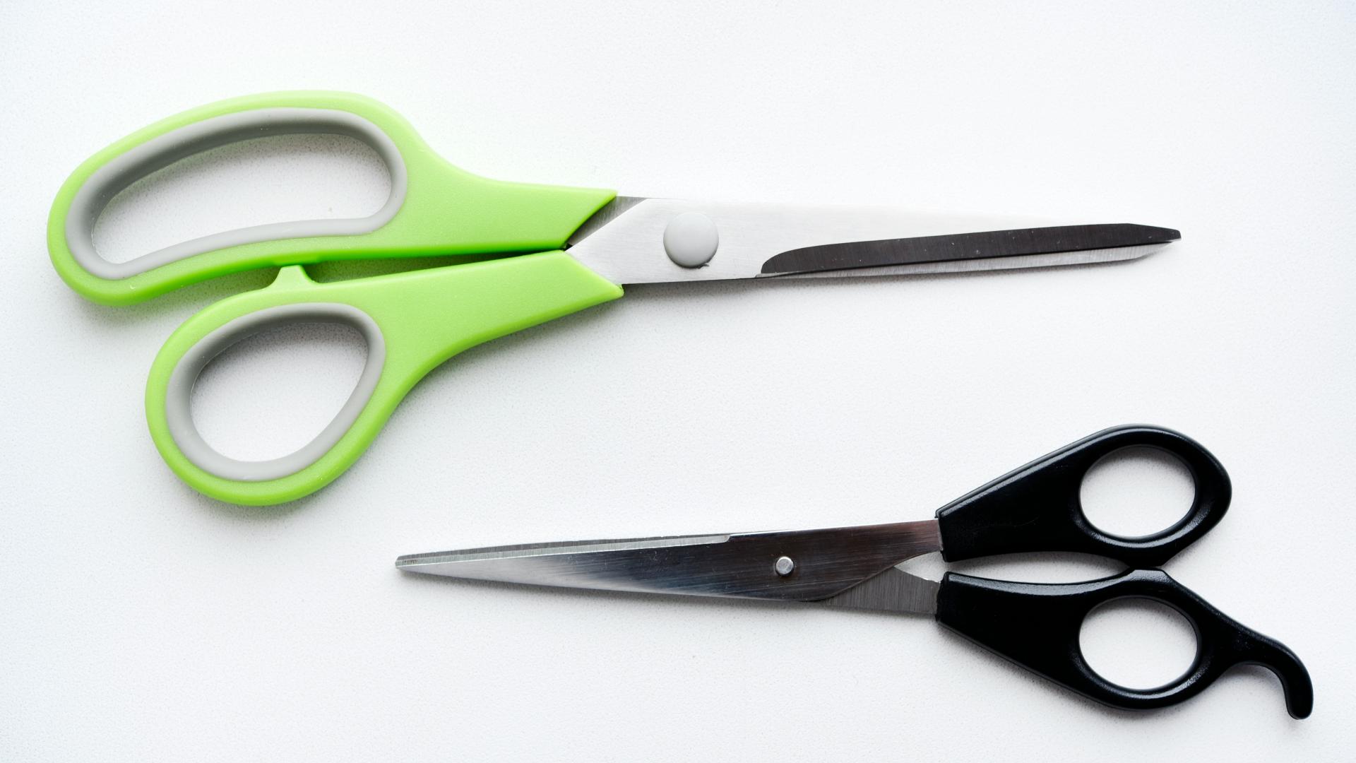
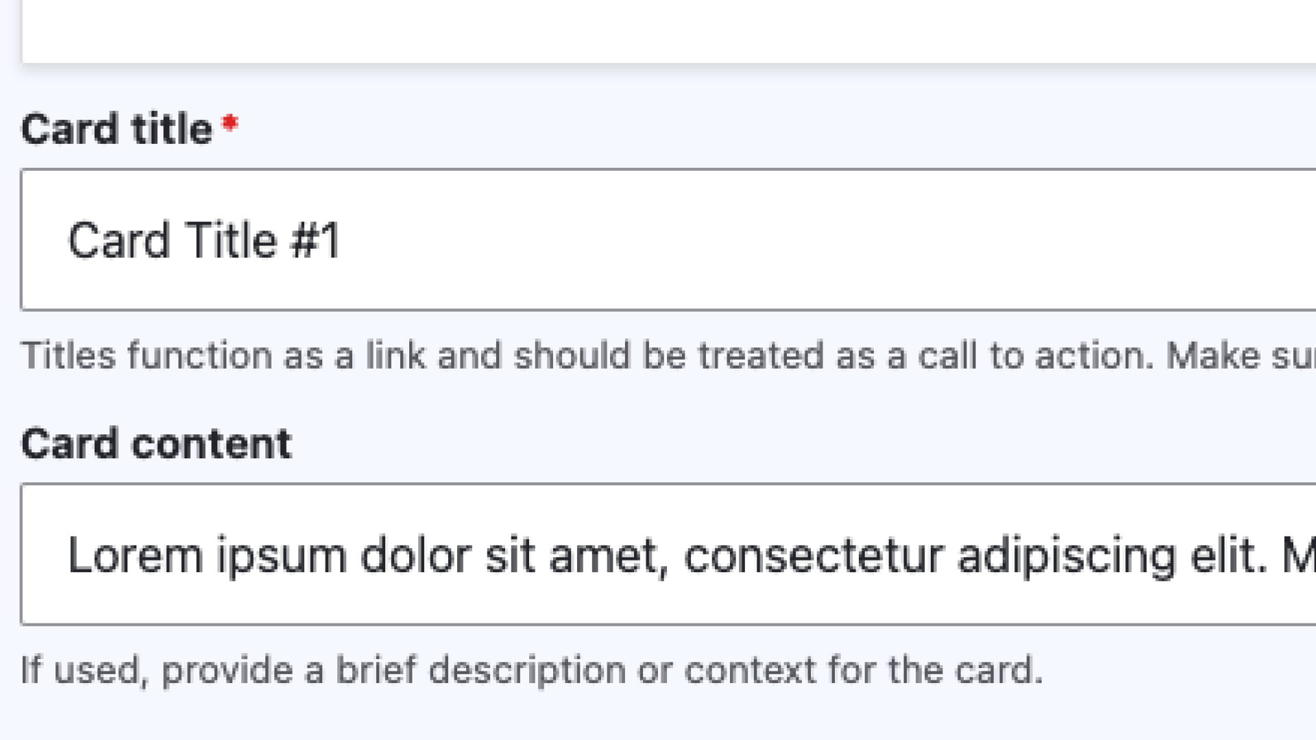
Card Title #1
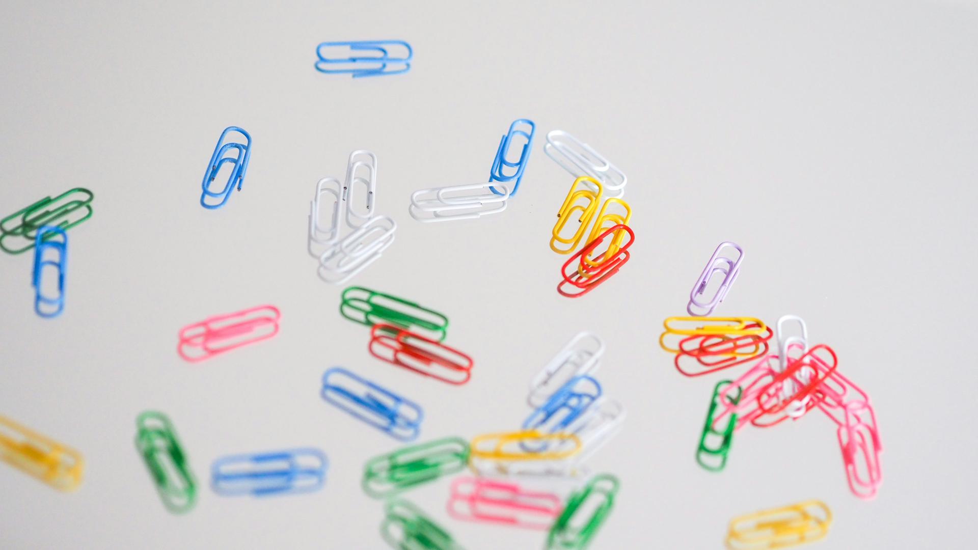
Card Title #2
Adding Cards
1. To create a card, start by adding a title and an optional description.
2. Adding an image is also optional, but makes a card more eye-catching.
3. Include an external url or an internal node.
Horizontal cards
Horizontal cards work almost exactly like regular Cards. They both require a title and a link, with optional fields for an image and content. The only difference between them is how they look on the page: Cards appear in a grid on a large screen, whereas Horizontal cards appear in a list, regardless of screen size.
Like regular Cards, the amount of content in a Horizontal card can impact how they display. Unlike regular Cards, a group of Horizontal cards with varying content won't create whitespace, as they don't display in a grid. However, the image and the space around it in Horizontal cards may vary depending on the amount of content.

Horizontal Card Title #1

Horizontal Card Title #2
Adding Horizontal Cards
See 'Adding Cards' above.
Emphasis
The Emphasis content row can help highlight a short amount of content or a direct quote. It's a simple content row, with online a content field, an optional credit or caption field, and a checkbox to exclude the quotation mark icon. Like with Cards, the content in Emphasis is capped at 255 characters, by default.
The Emphasis row can be used to help break up large paragraphs of content, draw attention to important information, or to highlight a quote.
Let the past hold on to itself and let the present move forward into the future.
Adding Emphasis
1. Begin by adding the content you would like to emphasize. Keep it brief for best results.
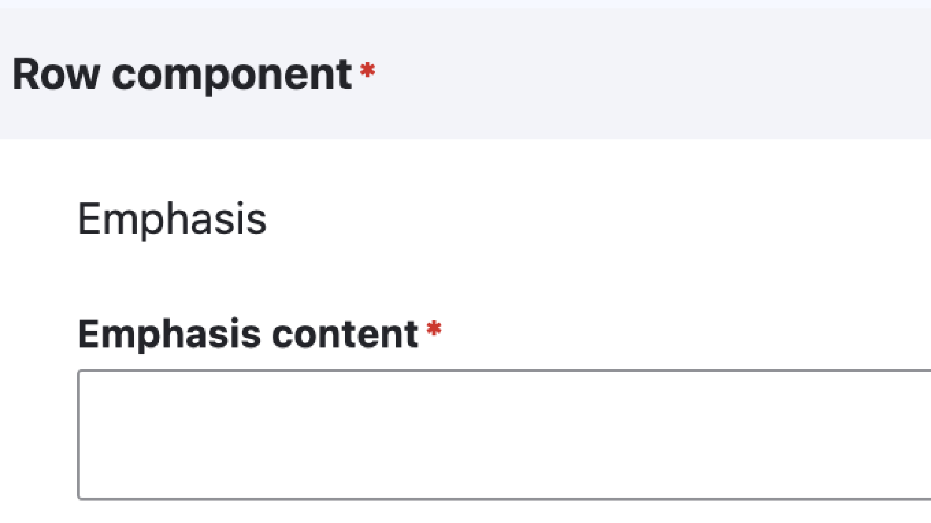
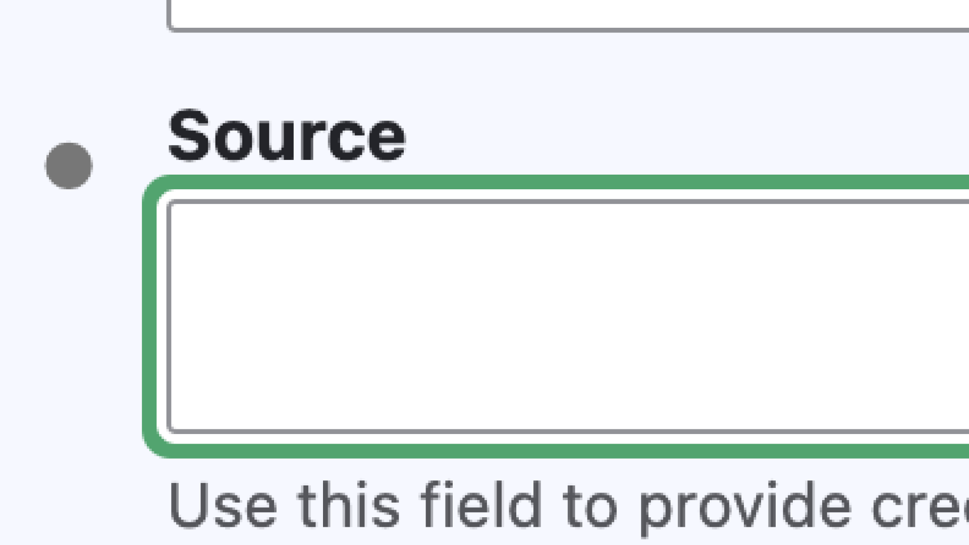
2. A source is optional, but highly recommended if using a direct quotation.
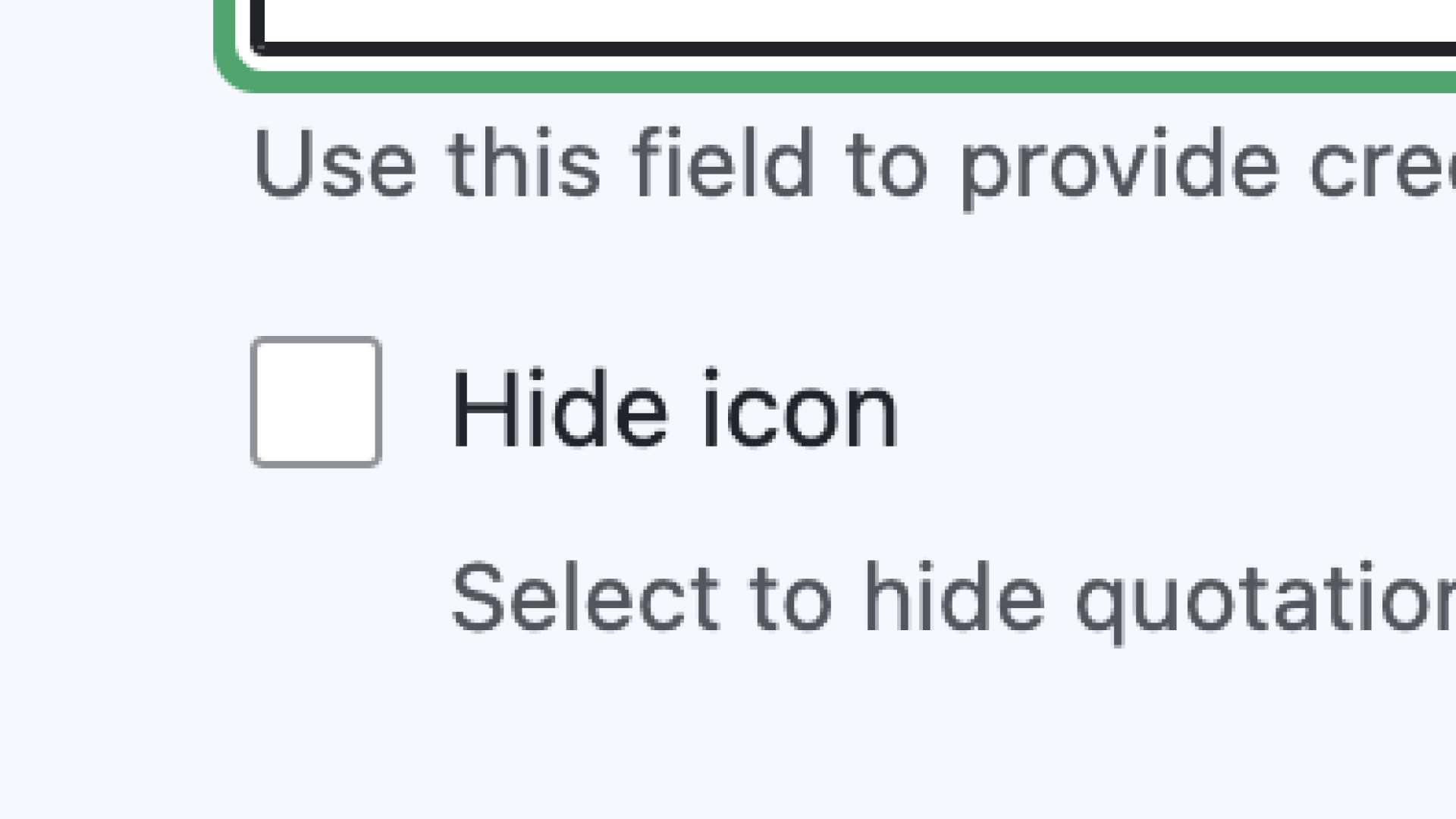
3. A quotation mark icon will appear automatically. If the emphasized content is not a direct quote, check 'Hide icon' to remove the quotation.
Links Block
The Links block content row is a useful way to include multiple links on a page. It's often used for a Related Links section on a page, but can be helpful in grouping together any amount of links.
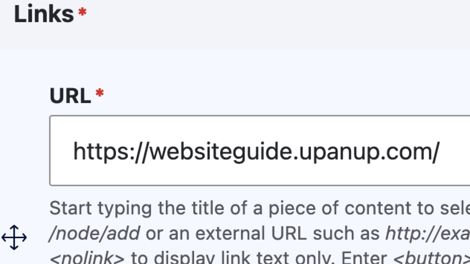
The Links block row includes a Block title, which will display as a heading above your group of links, plus a URL and Link text field for each link you add. The URL field allows you to search for a page by its title, paste in a URL path or, for external links, paste in a full URL. If you want to link a document in the Links block, and it's not coming up when searched, try finding the file you want to link in the media library and copying the "/media/file/name” portion of the URL into the URL field. Avoid using the full URL, as the file type and size won't display if the full URL is used.
Related Links Title
Adding Links Blocks
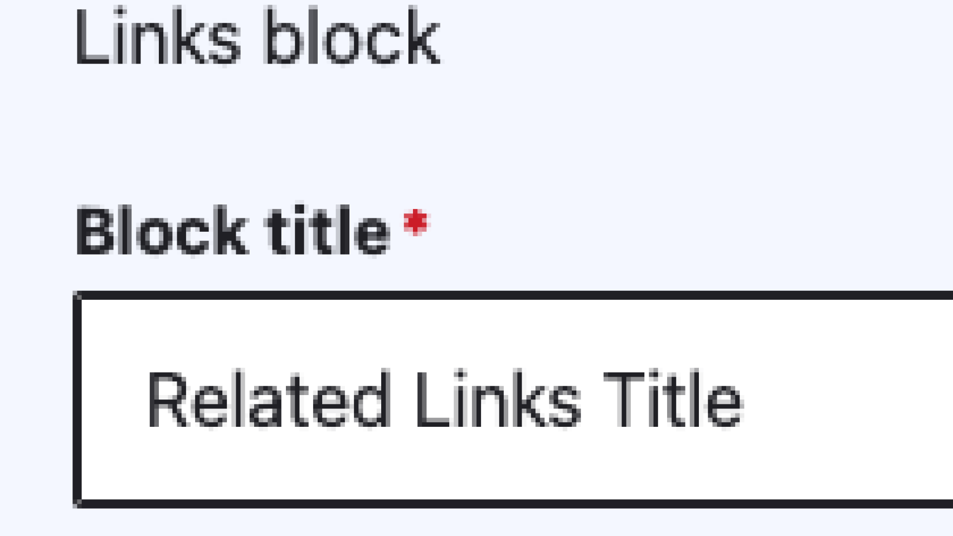
1. When creating a new Links block 'Related Links' is the default title, but this can be changed to best suit the block.
2. Include an external url or an internal node.
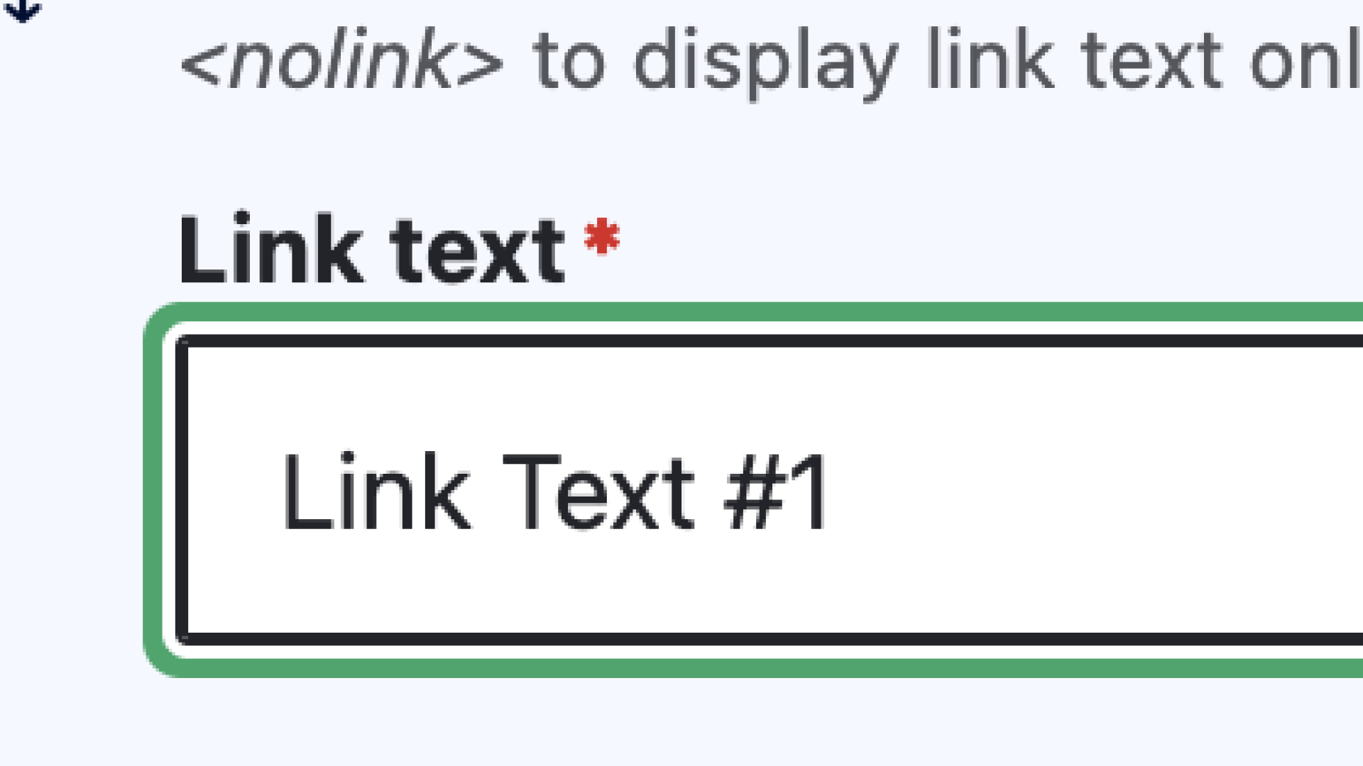
3. Finish by adding a link text that will describe where the link will lead.
Quicklinks
Quicklinks are just links with a FontAwesome icon. They can be a great way to provide a list of links with a visual cue.
Adding Quicklinks
1. Begin by picking a Font Awesome icon to represent your quicklink.
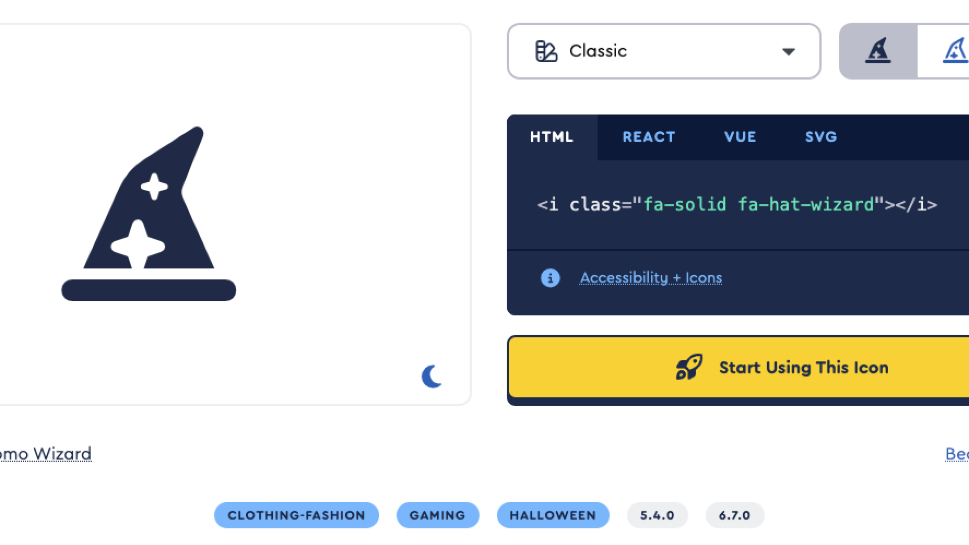
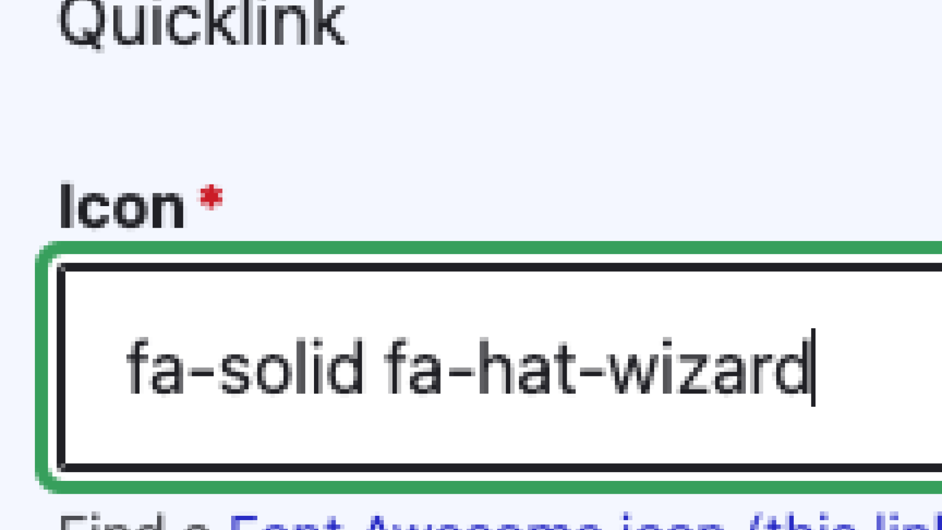
2. Add the full icon class (everything between the quotation marks) to the 'Icon' section.
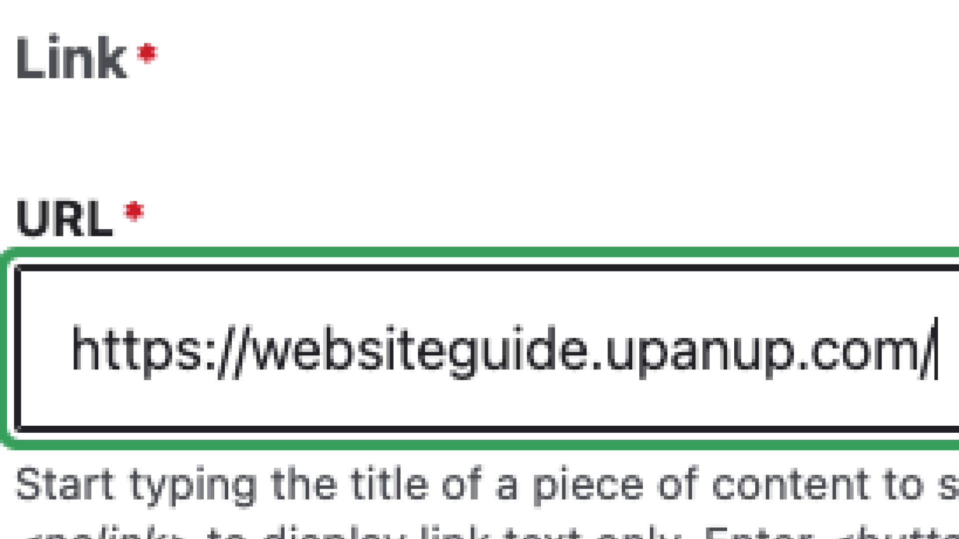
3. Include an external url or an internal node.
4. Include link text to inform users of where the link will lead.
View
The View content row is used to add a content type view to a given page. When adding a view, you can select the type you want to add from a select dropdown, and then select from the display options. There may also be additional options in an accordion, after you select your display.
Adding Views
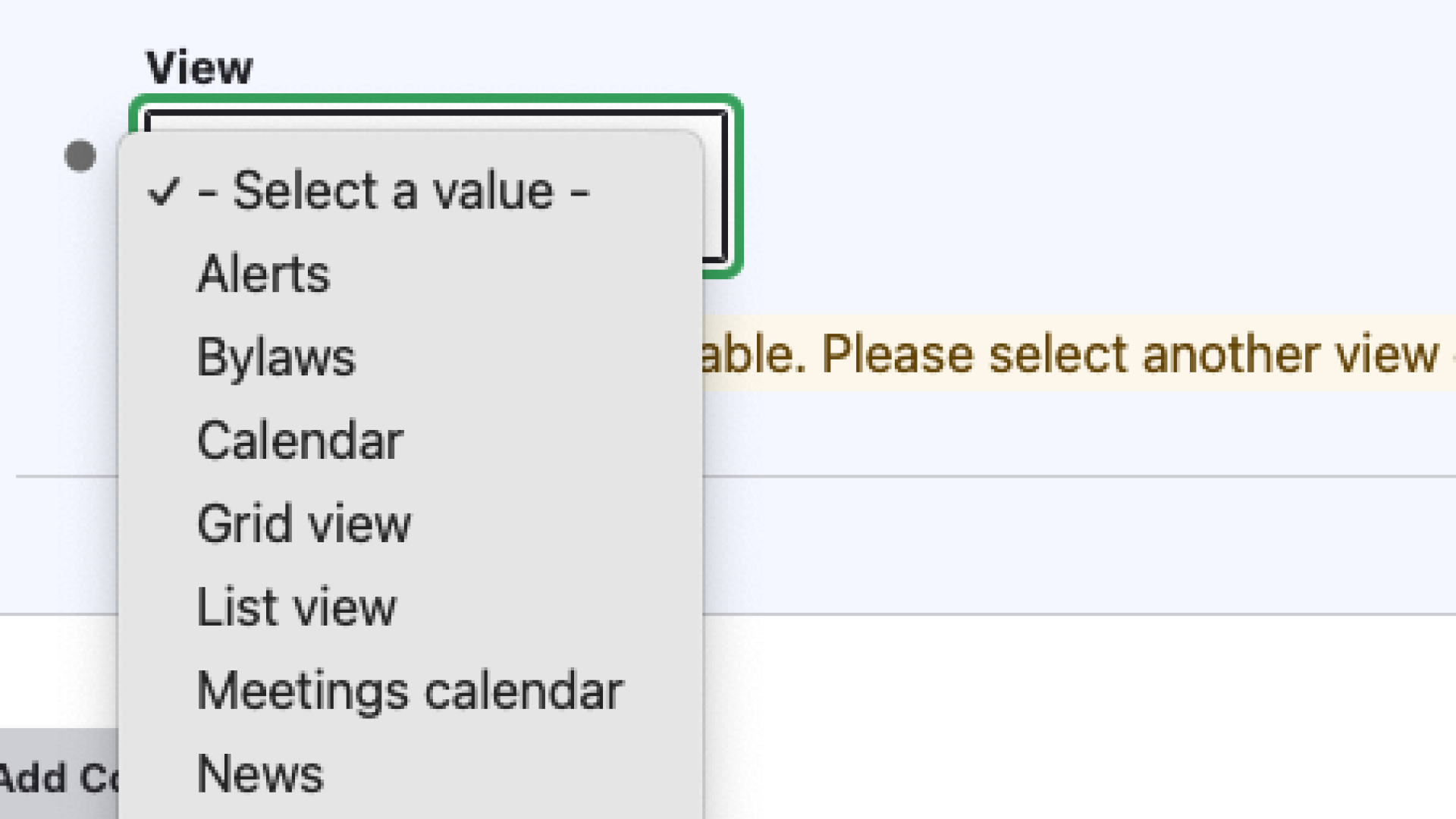
1. Select a view type. The potential views available for a website will change on a case by case basis .
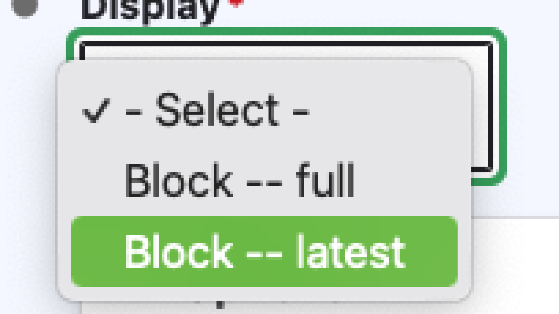
2. Select the display style. This will also change depending on the kind of view selected.
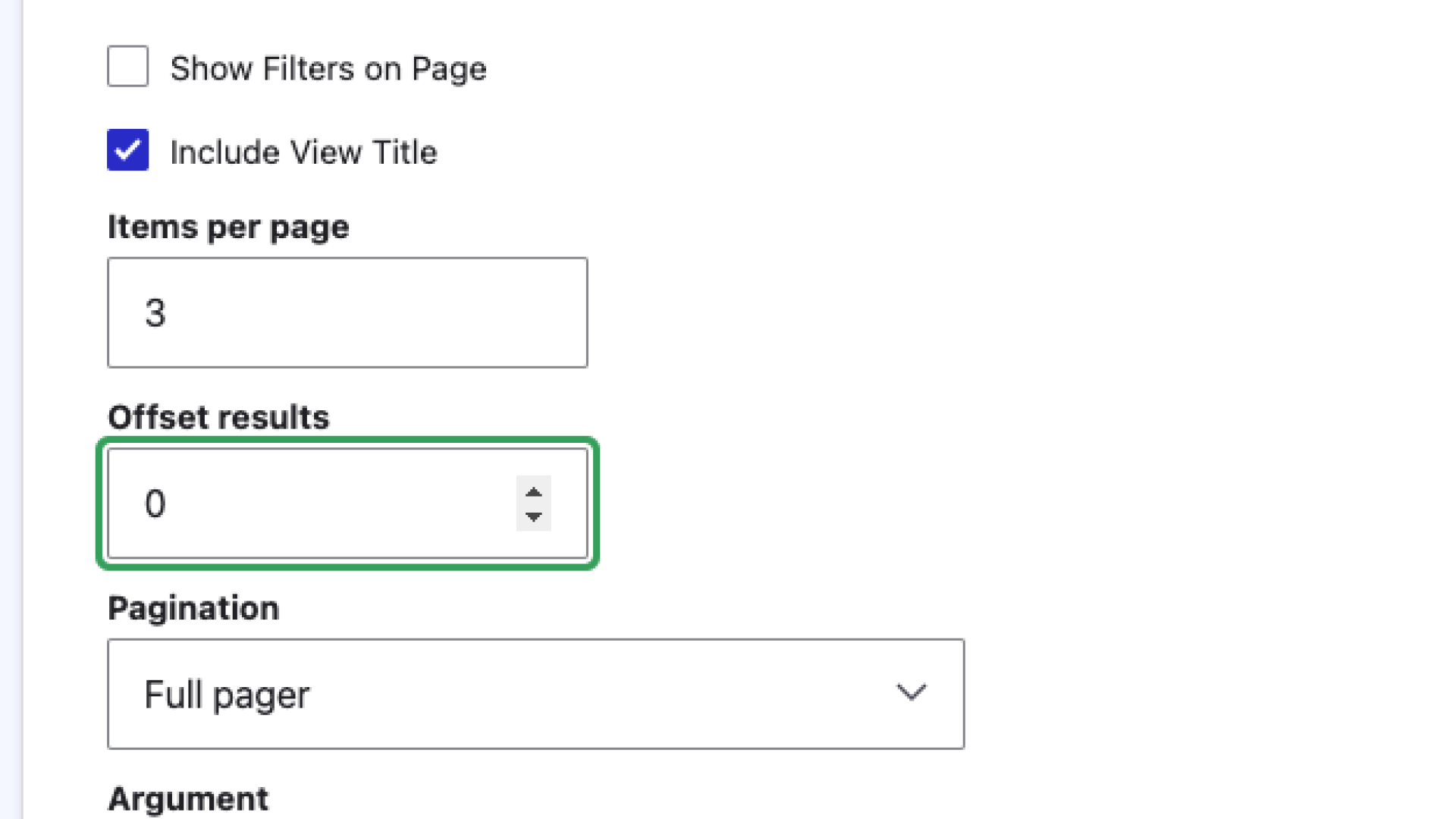
3. From the options menu you can choose to further adjust the view to fine tune how the content will be presented.
Webforms
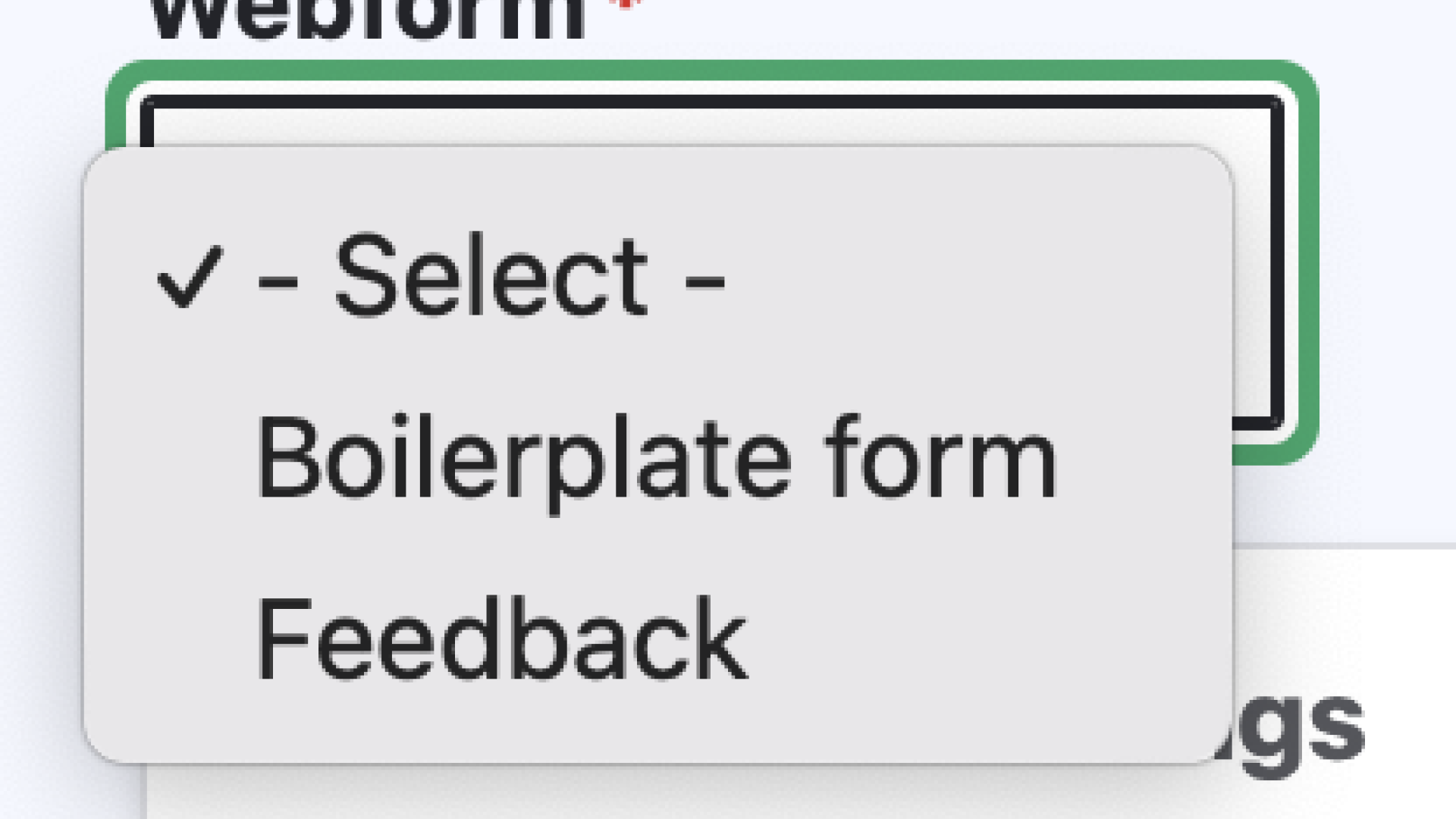
The Webform content row can be used to add a webform to a page, rather than having to link to it. To add a webform using the Webform content row, you will first have to create it (learn more about building webforms). Once you have built the webform you want to add to a page, it will appear in the select dropdown of the Webform content row. From there, you will be able to set a status: open, closed or scheduled, though setting a status is not necessary.
Adding Webforms
1. Begin by selecting a webform from existing forms.
2. Under 'Webform settings,' the forms can be set to open, closed, or scheduled allowing admins to change when forms can be submitted. This change will only affect this version of the webform.