Cards are a great way to create a visually prominent group of links. They consist of linked text and, optionally, an image and/or brief content describing the link. Because of their image and content option, Cards are a good choice for creating additional navigation for a section, or highlighting related content.
Cards may come in several options: Cards and Horizontal Cards. The main different between the two options is how they display on the page, either as a grid or in a column with the card body spanning the width of the content. Depending on your site you may also have the option to add an icon to your card instead of an image.
Within a Cards row, you can add multiple cards. Depending on your website's design, multiple cards will stack in columns of two to four.
In addition to the title and link, you can add and image or content to your card. Your images should be a JPG, 16:9 with a maximum size of 880x495px. Try to match your image to the card link destination, to support your users as they skim the page. For content on your card, the default text limit is 255 characters, or around 30 to 60 words. Both images and content affect the size of your card, so we recommend filling cards in the same row consistently.
Adding Cards
- Select Add Content row and then choose Cards or Horizontal cards from the list of Component Types and select Add Component.
- Begin filling in each field (each card requires a title and url; images and content are optional).Image
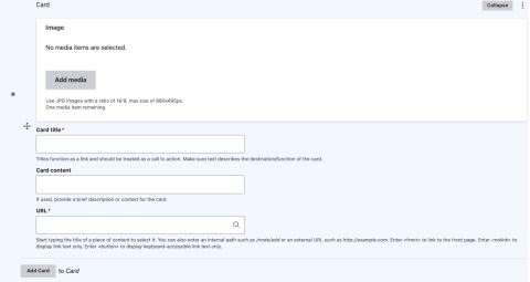
- Add title. As a link, your title text should be descriptive of the links destination (read more about link accessibility).
- Add url. Start typing the title of the content you want to link to, select the appropriate content node.
- To link externally, paste the full URL in this field. (must include http://...)
- Add content. Content should be relevant to the link destination.
- Add image. The image should be relevant to the content and link location.
- To add more cards select add card or add horizontal card
Cards Dos and Don't
Do's:
- Use cards with an image to add visual interest, promote important information or showcase community.
- Use clear, relevant, and easy-to-understand images and position image subject matter in the center of images.
- Use cards with no visual (none) for efficiency or if there is no appropriate icon or image available.
- Ensure the card hyperlink title is descriptive for user context. (set expectations on the destination of the link).
- Keep hyperlink titles short to avoid excessive text wrapping.
- Include a single action item within the card; use separate cards for multiple actions.
Dont's:
- Avoid low quality images. This reduces the visual appearance.
- Avoid stock photography with white backgrounds or abstract concepts (i.e. an isolated image or image of an object cut out).
- Avoid incorporating text within images.
- Avoid including full item description text within the card. Description text should be brief to inform users and encourage card selection.
Card Examples
Card Title

Card Title
Horizontal Card Examples
Card Title