
Accordions, also known as collapsible content, are a layout tool for streamlining page content.
Accordions work best when used for context specific information, not as a main method of organizing page content. Context specific means accordions must clearly relate to the content row title and body content. The main content is the context in which the accordions exist.
By collapsing specific information, the page layout supports a focused user experience which targets all users. The accordions themselves are not meant to target all users, the content is specific, so it fits the needs of specific users
Adding Accordion Groups
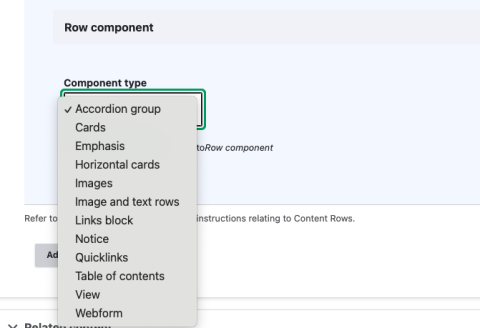
- Select Add Content row and then choose Accordion Group from the list of Component Types and select Add Component.Image
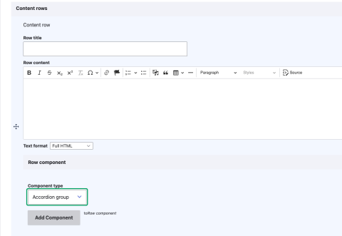
- Use the optional Row title for your accordion group (e.g. Frequently Asked Questions (FAQs). This is located above the accordion item fields. Image
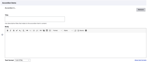
- Begin filling in each field (each accordion requires a title and body content).
- Depending on your site you might have an optional icon field. See our Quicklinks page to learn how to add icons.Image
- Depending on your site you might have an optional icon field. See our Quicklinks page to learn how to add icons.
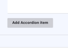
- To add multiple accordion items select Add Accordion Item and repeat steps 2 and 3.Image
Accordion Group Dos and Don'ts
Do's:
- The accordion title or label should accurately describe the content within the accordion.
- Use accordions to reduce height and collapse content that may not be useful for all users.
- Group and label a set of accordions appropriately to set clear user expectations for the content within each group.
Dont's:
- Avoid using accordion for content with high importance. Display important content by default to promote easy access.
- Avoid the use of all capitals in accordion titles for better accessibility.
- Avoid excessive use of hyperlinks or action items within a single accordion to maintain focus on essential information and actions